Interview: Ted Fendt
After three splendid shorts—Broken Specs (2012), Travel Plans (2013), and Going Out (2015)—writer-director Ted Fendt makes his similarly extreme-low-budget feature debut with Short Stay. It’s the story of Mike (Mike MacCherone), a young man from Jersey City who has a brief opportunity to assimilate to this world thanks to a new job in Philadelphia. Employing an approach neither naturalistic nor formalistic, the film establishes and elaborates upon its universe without following any moviemaking trends, or creating a fashionable look. Its gentle and yet rigorous mise en scène paints the character’s loneliness, frustrations, and desires with a layer of unusual subtlety. Like a Matisse painting or an old Scott Joplin recording or an Etruscan vase, Short Stay bares the traces of its making, displaying an original sense of beauty almost forgotten in contemporary American cinema.
This interview between filmmakers Matías Piñeiro and Fendt (who is also a translator of subtitles and books, and a projectionist at the Film Society of Lincoln Center) took place in March during New Directors/New Films, where Short Stay had its North American premiere.
Short Stay
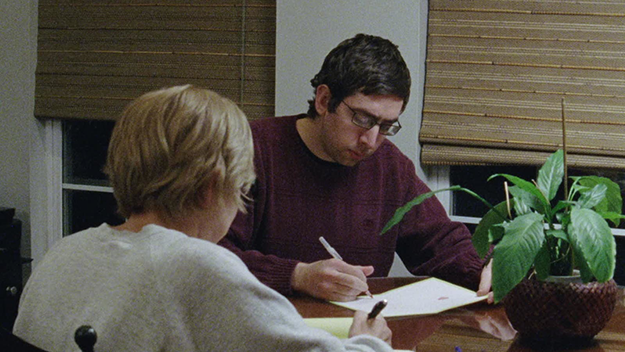
After watching Short Stay again, I couldn’t help noticing that money is a motif that runs throughout the film. The main character’s need for both a job and a roof over his head provides a social commentary on middle-class America that may not be perceived at first. Were you conscious of this motif while the writing the script?
It’s funny that you mention the money, because it’s a problem I find in my writing. It’s an obstacle I can’t seem to get past, in that I do feel I always have to justify how people are living. Rohmer talks about how he never shows people working in his films. They have employment, but it’s very much a textural thing in the background. But, for me, because it’s such a fundamental aspect of our lives, it has to come up. Even with Mike’s job, working for a second-rate tour company, one wonders how he could survive. But the thing is, in Philadelphia, rent is so cheap that one could actually get by working that job. So even if it seems crazy, it’s actually quite realistic.
This economic and social tension is not only part of the film’s story but it also seems to influence its framing and camera movement. There is a shot I particularly like in which, while still sleeping on the streets, Mike finds a wallet on the ground.
The scene begins with a shot of the street, to show that there’s no one coming by. And then it pans to the right, and down to Mike sleeping on the ground, and then tilts to the wallet. The pans are not motivated by characters’ movements—he’s not moving—it all happens before he really wakes up.
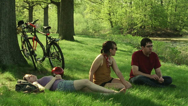
There are a couple of things to say about the framing. We shot the entire film with a 25mm lens, and I wanted to shoot every scene from one camera position. These were rules we set beforehand, which led to the later rule of shooting every scene in one shot. For the exteriors, there is the freedom of being able to move around. We didn’t want to obstruct traffic or anything, so for that particular shot, the furthest back we could go was the street. You needed to see Mike’s entire body and you needed to see the wallet. Part of the idea of the framing within these rules is that I would eliminate creativity from a lot of the decisions. This would lead to surprising solutions, particularly in the interiors.
There is a sense that the film’s composition is very much rooted in the present tense but without being spontaneous or gimmicky. You’ve talked about how the lens contributed to the form of the film, but I found a similar approach with the film’s décor as well, as in how plaques, cables, bottles, lamps, bulbs appear in your frame. In other films, those assorted elements might be taken out or hidden because of preconceptions of how a shot should look. Your inclusion of them gives the film an original look. And, at the same time, it doesn’t feel as if you have decided to put those items there.
I have a deep dislike of set design. And so when we would shoot in people’s apartments, we wouldn’t do very much in terms of reorganizing the objects in the room. The way that people arrange things is very specific to them, and specific to their own space. That was one of the contrasts I wanted to emphasize—the way that Mark and Dan’s apartment is kind of a mess while the apartment of his girlfriend, Marta, and her roommate, is much more homey.
Could you talk about filming in public spaces? The movie takes place in Philadelphia and Jersey and there are many scenes set in the streets. What is your attitude toward outdoor shooting and in these cities in particular?
It might be pretentious to put it this way, but I’m trying to return in some ways to early sound cinema, which, before mixing technology was developed, had to finesse the sound in order to erase imperfections and unforeseen elements of direct sound recording on location. This is why the film is 98 percent direct sound, and all the exteriors use just location sound. I think that it provides a sense of immediacy of place that wouldn’t exist if the sound were fabricated in a studio.
Short Stay
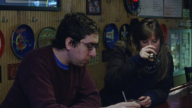
Your characters tell each other stories, in a monologue-like style. It is interesting to see nonprofessional actors delivering such long and detailed speeches. How did you approach this with them?
There are two kinds of scenes in the film in terms of dialogue: there are the scenes I wrote the dialogue for and the ones where I had the characters retell a story the actors had already told me. In the script, it would say, “Meg talks about her day,” but then I would ask her about something that happened recently at her job and we would rehearse what she told me a number of times so that she would have a structured story and would know how to tell it.
How did you feel about going from a short structure to a longer one?
I don’t know that I thought too much about it. I had one scene that I started out with and worked to build it from there. I had wanted to do something larger and more developed and spend more time with whoever the main character was.
I think that in the longer structure you were still as efficient as you were in your short films. But now you were able to draw different more from your ambiguous main character, who isn’t always nice but is still strangely likable.
Like the shorts, the narrative is guided by the characters, even if there is a structure in parallel with them. The decisions that are made by the characters have to be true to them, and that’s the only thing I’m thinking about and not trying to fit that to some pre-existing form. The form eventually is found, but it’s coming out of something else.
How do you think the small-scale shooting of the film influenced the structure of the film?
Probably directly. This film, like the shorts, was made with the same very small crew. Sage Einarsen was on the camera and lighting, and my friend Sean Dunn did the sound. Britni West and Blake LaRue alternated as producers/focus pullers. They would also help me make the sandwiches for everyone’s lunch in the morning. If you have 50 people, and lots of departments, it can slow things down in a way that wouldn’t necessarily be advantageous to how we were working. We shot the movie in less than 20 days over a period of three months.
Would you continue working in this way?
I would hope to. It’s a weird because I guess the capitalist thing is to get bigger with each project, but then you look at someone like Rohmer who spent the ’70s making these very large-budget 35mm films and then did the opposite of most everyone else in the history of cinema: he went on to make 16mm films with very small crews throughout the next decade. And the recent films of Jean-Marie Straub, for example, were more abstract films but therefore more concentrated and concrete films. I don’t know why one wouldn’t pursue that.
Short Stay
As with your shorts, Short Stay was shot on film and you made a 35mm print of it. What are the advantages of owning a film print in a world that is turning digital?
When I decided to commit to that kind of aesthetic a few years ago, I was making enough money to make one short film a year. With the feature, it was basically the same. I was making more money in my job, but the post-production and the print pushed it a bit at the end. When I was making the film I was seeing a lot avant-garde stuff, where people had still not abandoned that aesthetic. Films by Jodie Mack or Nathaniel Dorsky, who only works on film. So I was in enough of a bubble to think it wouldn’t be that unusual for someone to do. But, yeah, it’s depressing that the cinema has changed and we’ve had to live through the transition into digital projection.
You work as a projectionist. Have you ever projected one of your own films?
I have. It was a terrible, uncomfortable experience because at that point I had distance from the movie, but now had to think, “Oh, I wish I had done this differently…” It was hard for me to look at it enjoy it. I think I need even more distance, maybe a year or two, before it doesn’t feel like I’m looking at myself in the mirror.
How did you approach color and lighting on Short Stay?
The lighting was basically we could get on location. And the color correction was basically as minimal as possible. I just wanted it to look like the negative. I didn’t want anything heavily manipulated, as they tend to be in a Steven Spielberg movie or Clint Eastwood movie, where there’s a lot of color work done and there’s a very plastic quality.
What have you been watching lately?
I saw Malick’s Knight of Cups yesterday—probably the best film he has ever made. I plan to see it again tomorrow, and I hope to see it seven more times before it unglamorously gets thrown out of theaters because Americans have turned their back on him for reasons that will remain mysterious to me for as long as I live. [Laughs.] His is the most avant-garde cinema you can encounter in contemporary cinema in terms of narrative structure and the primordial belief in the power of image and sound.
Matías Piñeiro is the director of Hermia & Helena, The Princess of France, and Viola.


