Interview: Jan Roelfs
This article is part of a series of interviews conducted at the 2019 EnergaCAMERIMAGE International Film Festival in Toruń, Poland.

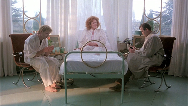
A Zed & Two Noughts (Peter Greenaway, 1985)
Peter Greenaway’s decade-long collaboration with production designers Jan Roelfs and Ben van Os yielded some of modern cinema’s most stylized and idiosyncratic sets. Centered on the love triangle between two twin zoologists and the woman who lost a leg in the car accident that killed their wives, A Zed & Two Noughts (1985) marks the trio’s first time working together and epitomizes the precision, flamboyance, gravitas, and irreverence that permeate such films as Drowning by Numbers (1988), The Cook, the Thief, His Wife & Her Lover (1989), Prospero’s Books (1991), and The Baby of Mâcon (1993)—all shot by master cinematographer Sacha Vierny.
An Honorary Award recipient at the 2019 EnergaCAMERIMAGE Film Festival, Roelfs sat down with me to discuss the perseverance and perfectionism that went into crafting Greenaway’s movies and his subsequent introduction to Hollywood.
How did your creative partnership with Peter Greenaway originate?
The way I remember it is that Greenaway came to the Rotterdam Film Festival with The Draughtsman’s Contract [in 1983], and I saw him there with my co-production designer, Ben van Os, whom I had been collaborating with for a year or two. Then a couple months later, Kees Kasander, the producer of A Zed & Two Noughts, asked us to work on that film.
Do you think the fact that you’re Dutch played into Greenaway’s decision to hire you?
[Laughs] It may have had something to do with it. Greenaway is, of course, very passionate about Dutch paintings, the Rembrandts and Vermeers, and A Zed & Two Noughts was made in Holland.
A Zed & Two Noughts anticipates the aesthetic of The Cook, the Thief, His Wife & Her Lover through its juxtaposition of the grotesque and the sublime. How did you and Greenaway lay out the foundations of that visual language?
You have to realize that Greenaway was such a dominant force. He came with so many great ideas, so I was executing his vision rather than coming up with my own—I give him all the credit. His references are always paintings. So we analyzed paintings, and the settings and looks came out of those.
What were Greenaway’s references for A Zed & Two Noughts other than Vermeer’s paintings for the scenes involving Doctor Van Meegeren?
All the references came from Vermeer’s work. There are 26 paintings by him hidden throughout A Zed & Two Noughts, and the surgeon is named after one of his imitators.
The spareness and ethereal glow of Alba’s hospital room are also reminiscent of the resurrection scene in Dreyer’s Ordet.
Sure.
Would Greenaway arrange elements in the frame himself?
No, but he was very meticulous. Symmetry was a big thing. I think there was a music sheet on a piano in A Zed & Two Noughts that said, “Symmetria omnia est,” which means, “Symmetry is all.” So we quite often did symmetry, like with the characters of the twin brothers, and the set dressing was mirrored, too.

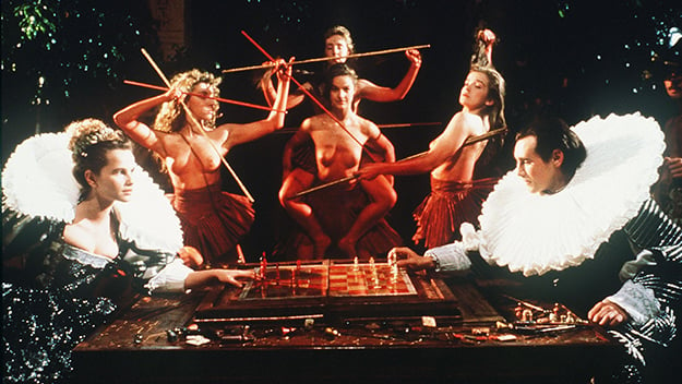
Prospero’s Books (Peter Greenaway, 1991)
It’s also for the sake of symmetry that Alba’s remaining leg is amputated…
Correct. It gives the boys easier access to her. [Laughter] We didn’t set up too many shots per day because some of them were very complex—they were framed and dressed within the frame itself. It was almost like an opera set: everything was very layered, static, and precise. The actors didn’t move and could only walk a certain way. I encountered a completely different type of filmmaking over the years, but what I did with Greenaway was quite an extraordinary learning curve.
Did you previsualize the sets with drawings?
No. What’s strange about Greenaway is that people think of him as a very visual artist, but that’s actually not the case—he tends to engage with the setting on the spot.
Then was I wrong to assume that the spaces in The Cook, the Thief, His Wife & Her Lover were detailed in the script?
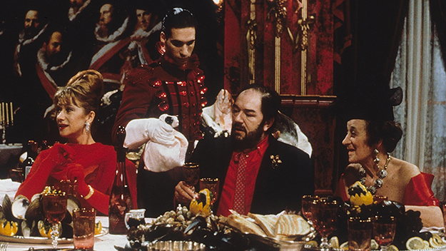
They were all developed in preproduction. At that point, we had done like eight projects with Greenaway in 10 years, so sometimes we would finish a film and say: “That didn’t work… Let’s set up the next one much stronger.” And that’s how we came up with the idea of going really color-coded for The Cook, the Thief, His Wife & Her Lover, with a red restaurant, a green kitchen, a blue parking lot, and a white bathroom.
Was it clear to you that the production design would serve as a metaphor for the characters?
It was obvious that the thief played by Michael Gambon was bombastic, brutal, nasty, and vulgar, and we translated those words into voluptuous, decadent, and over-the-top table settings. That’s what production design is all about: you see what the characters need to be and enhance them. When the actors walked into the set, they became crooks—they were spitting and were horrible, and I remember Gambon came to me and said: “This is fucking awesome.” Another great thing was that Michael Nyman had prerecorded “Memorial” [the theme song], which played live on set, so the actors moved in rhythm with the music.
You shot the film on one continuous set, right?
No, we did it in separate sections. It was a cheap movie, and we could never afford to light and decorate the sets simultaneously with all the extras, wardrobe, and hair and makeup. We built the sets in pieces in Amsterdam over several weeks, shipped them out to London, and then assembled them there. We shot three weeks in the red restaurant, about two and a half weeks in the green kitchen, then built the white bathroom. We created the size of the walls so that the tracking shots could cut over black, and we would pick up the same shot later on. The parking lot was done outside the old Elstree Studios in London, where we filmed the interiors. And the lover’s book depository was basically the backside of the walls—we would turn them around and fill them up with books.

The Cook, the Thief, His Wife & Her Lover (Peter Greenaway, 1989)
How did you achieve such a remarkable symbiosis between the cinematography and the production design?
We did a lot of tests because the colors were so extreme: green is very tough to render on film since it absorbs so much light. We kept painting the frame edges lighter green until the day before the shoot, and the sets actually looked a little scary to the natural eye.
Sacha Vierny’s presence as director of photography inevitably invites associations with movies he shot for Alain Resnais. In fact, Helen Mirren’s final costume seems to be a direct nod to Delphine Seyrig’s feather-collared black cape in Last Year at Marienbad.
Yeah.
Did Jean-Paul Gaultier intend that parallel?
Yes, he was another amazing collaborator… You know, people were outraged by the film when it was released because of the way Helen Mirren’s character is treated by her husband. But she’s the one who comes out strongest in the end.
I actually see The Cook, the Thief, His Wife & Her Lover as a kind of feminist revenge tale for that generation, just like Kill Bill is for mine.
I agree, and the ending is so dramatic when she says to him: “Eat the cock, you know where it’s been.”
There’s almost a mathematical logic to The Cook, the Thief, His Wife & Her Lover, whereas Prospero’s Books, Greenaway’s rendition of Shakespeare’s The Tempest and one of your last films with him, makes for quite a tumultuous and nightmarish viewing experience. How did you tackle the visual heterogeneity of Prospero’s Books, which alternates between images of scale models, reenactments of Renaissance and Baroque paintings, and strikingly kinetic representations of the four elements?
In complex cases like this, you break down the script to figure out what you really need and what you can afford. We had about 20 real settings and 47 mirror settings with frames in Prospero’s Books. The Laurentian Library was one big set, but we made it a little smaller. We didn’t have a lot of money, so we only had one piece as a reverse wall which we would move quickly to another side. Afterward, we took an old shipping yard in Amsterdam where we built the bathhouse—we basically dug up a hole in the floor, built a swimming pool, poured a concrete slab, and built hundreds of columns for the arches. Another big task was to build all the books, which took months and required the help of 30 to 40 film students. Some books were the size of this room, and the characters were sliding and gliding over them.

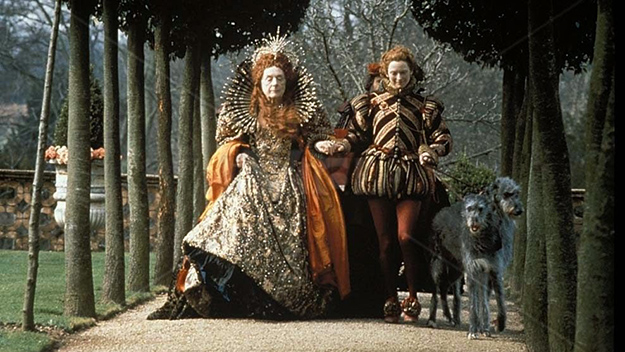
Orlando (Sally Potter, 1992)
Your work on Sally Potter’s Orlando [1992], which unfolds over three centuries, is also a compelling example of how production design can sustain and unify a fragmented narrative.
Orlando was a bit more traditional filmmaking, but its challenges were humongous too—it took Sally and her producers several years to get funding, and it wasn’t that much money either. Sally wanted to have the Hatfield House [where Orlando lives] in scaffolding to suggest that it was being restored, but we couldn’t afford it. Instead, we wrapped the whole building with industrial plastic, like a crystal, and there are no post effects—we did it all live over a weekend with 50 people.
What did it feel like to transition from this handcrafted approach to an industrial one when you relocated to Hollywood in the mid-’90s?
I went to Los Angeles after I broke up with my production design partner [van Os, who passed away in 2012]. I had only been there for three days when I found an agent in the Yellow Pages. They signed me up the next day, and I was hired to work on Gillian Armstrong’s Little Women [1994] two days later. I scouted for a week in Concord, Massachusetts, where the story takes place, only to find out that we were going to shoot in Canada. [Laughs] That was my first American movie and a big challenge, but it didn’t feel any different. I must say that the American system really embraces me as a production designer and gives me the time and tools to do my job properly. I sometimes miss the other craziness, but this is also crazy.
And what does being a production designer on a CGI-driven film like Ghost in the Shell [2017] entail?
I create the world in preproduction, and out of that, we decide what’s going to interact physically with the actors. Nowadays, we do everything in 3D concepts that go straight to previsualization, so the world of the film is already live on set. I’m not afraid of the new toys, and that’s why I also do crazy big movies like Fast & Furious 9, which I just finished and on which I built massive sets. What I appreciate about that franchise is that it caters to the lesser side of the social spectrum, whereas something like the James Bond series is always on the fancy and glamorous side of the world.
Yonca Talu is a filmmaker living in Paris. She grew up in Istanbul and graduated from NYU Tisch.


