Game Changers: Production Design
Production designer,” as a term, was initially employed as a publicity stunt by producer David O. Selznick. He used the credit in Gone with the Wind. The 1939 film was supposed to be the biggest of everything—the longest, the most lavish, the most extras. A simple “art director” would not do, and so Selznick dubbed William Cameron Menzies the film’s production designer. The title was used off and on after that to signify a big film, like Giant or Lawrence of Arabia.
The credit “production designer” is a fairly recent one. For a long time, the credit was “art director.” (The Oscar category only changed from “Best Art Direction” to “Best Production Design” in 2012.) The newer term caught on in the 1970s. At the time I was told that the man who popularized it was Richard Sylbert, who did the production design for Who’s Afraid of Virginia Woolf? and Chinatown. The idea behind the new credit was to put one person, other than the director, in charge of the visual elements of the film, so as to unify the design and end all the usual turf battles that a production had about the visuals.
That meant that the art direction, the set construction, the set decoration, and the wardrobe, as well as the makeup, props, locations, and scouting, all came under the control of the production designer. All the visual elements of the film were channeled through him. That created then a troika of creators for a film: a director, and under the director, the cinematographer, and then the production designer. Now, the term has lost much of its meaning. When it was first used, a production designer had more power.
The Cabinet of Dr. Caligari
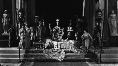
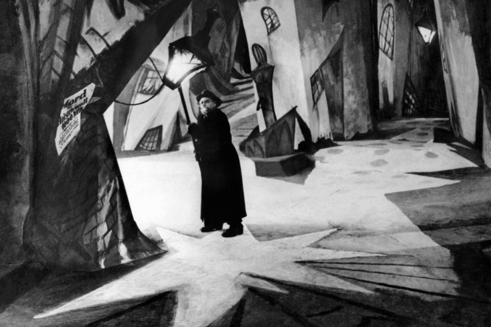
For the first three or four decades of cinema, movies were chiefly made in a studio or backlot because of the demands of light and sound. In this pre-location-shooting era, the sets were generally designed to be realistic or unrealistic. Unrealistic sets were built for science fiction, horror, and imaginary or surreal worlds: The Cabinet of Dr. Caligari, Nosferatu, Metropolis, Frankenstein, The Wizard of Oz. There is a very rich tradition of unreal sets. I used them in Mishima to designate a fictional world.
But otherwise, sets were intended to appear realistic. The idea was that you would recognize what you saw as the real world. They weren’t realistic, of course. The sets were too big because the cameras were too big, the lights were big, and the crew was big. Even poor people tend to live in very big rooms in the movies. The tradition continues today—the New York City secretary in a $2 million condo.
A set could also be realistic but tailor-made for accommodating a specific shot. There’s one I particularly like in a Frank Borzage film called 7th Heaven. A multi-level set was built for a particular shot. In Adam Resurrected, I built a mental hospital for one shot. It was somewhat surreal because it was in the middle of the Negev desert in Israel. At one point, Jeff Goldblum goes searching for a dog. The camera goes all the way from one corner of the hospital set to the other corner.
The Conformist
Something interesting started happening to realistic sets in the ’70s, by which time realistic sets meant locations. Technological advances helped change the concept of location shooting. The camera became lighter, with the Panaflex; the film was faster. New filters allowed you to shoot in small rooms, even in a bathroom. The Kino Flo was a fluorescent tube that is adapted in such a way that it doesn’t cause a flicker on screen. You could just tape some Kinos to the wall and light a very small space. All of these advances helped give rise to road pictures like Easy Rider, The Rain People, Two-Lane Blacktop: you could just drive across the country and shoot your way through on real locations.
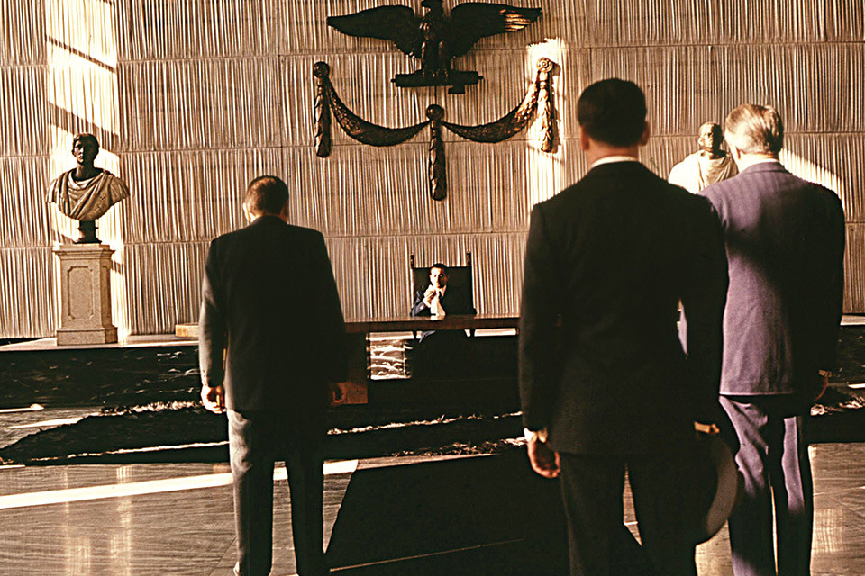
The other thing that changed how people thought about location shooting was The Conformist. This was a milestone in the history of production design, in the fullest sense of the word. To my mind, you can speak of pre-Conformist and post-Conformist design.
When we did American Gigolo, we worked with the production designer of The Conformist:a man named Ferdinando Scarfiotti. He had begun working with Luchino Visconti on a lot of theater work, and they did Death in Venice together. When they brought in Vittorio Storaro on The Conformist to do the cinematography, they had that troika—in my opinion, one of the most incredible visual troikas in the history of movies.
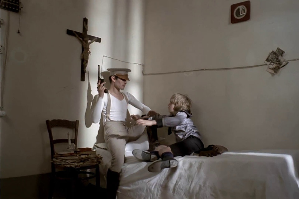
The Conformist
The cinematographer of American Gigolo, John Bailey, mentioned The Conformist to me. There were all these TV shows that shot on location in Los Angeles. So for our film, we wanted to shoot Los Angeles with fresh eyes and make it different from what everyone else had tried to do with it. We tried to get Scarfiotti because we figured that if he came, he’d see L.A. in a new way, since he’d never worked here.
The Conformist was a synthesis of Godard’s self-consciousness and the pictorialism of Visconti and Antonioni. What Bertolucci with Scarfiotti and Storaro did was combine the visually rich Italian tradition with the French intellectual tradition. After The Conformist, the three went on to make Last Tango in Paris. And after Scarfiotti did American Gigolo, we did Cat People together. We became friends, and he’s someone whose visual style has transformed me.
I think visually, as opposed to literarily. I come from a Calvinistic background that was very Cromwellian in its fear of images. Somehow I started to get this notion that you could have a poetry of images, rather than just a poetry of words. And when I started meeting with Ferdinando, that really became clear to me.
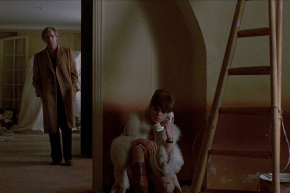
Last Tango in Paris
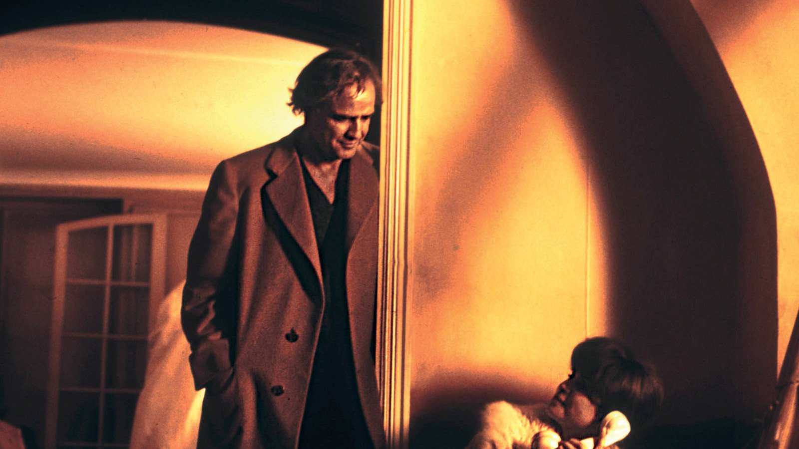
For example, in an interview, he talked about the set for Last Tango in Paris, for which all the walls had been painted. There was a bare room, a ladder, and, presumably, a piece of furniture with a sheet over it. Bertolucci asked him what was under the sheet. Scarfiotti said he wasn’t sure, but he thought it might be Brando’s character’s id.
That’s a pretty good example of visual thinking. That sheet never comes off, you never find out what’s under there, but it means something, in the same way that Monica Vitti’s green coat means something in Red Desert. In Cat People, we did something very similar; in the house where John Heard’s character lives, Ferdinando wanted to have an MG car in his garage, covered with a sheet. So I asked him: “If we never take the sheet off, then why do we have to get a real MG?” He said: “Because you’ll know it’s an MG under there.”
So here’s the radical importance of The Conformist: this to my mind is the first film shot entirely on location in which the locations are treated as sets. It has the same freedom with a location that you would have if you had designed your own room. Scarfiotti, Bertolucci, and Storaro would go in and take a room and treat it as a tabula rasa. Bertolucci and Scarfiotti worked in locations that were completely transformed for the movie or that were selected because of their graphic, visual qualities.
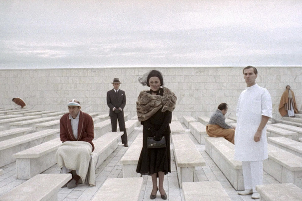
The Conformist
When Jean-Louis Trintignant goes to the mental hospital to visit his father, it looks nothing like a mental hospital—it’s more like a visual idea of a mental hospital. And this film is full of visual ideas. There’s a scene with all these walnuts on a table. I once asked Ferdinando why the table is covered with walnuts, and he just responded: “I thought it looked good.” It’s a visual idea, one that you can’t explain with words.
I’ll give an example from American Gigolo. The opening scene takes place in a house on the beach. We had two scenes there: the opening scene where Richard Gere talks to Nina Van Pallandt, and then a later scene where they go out and walk on the beach. Ferdinando couldn’t find a location he liked. I’d say: “But there must be 50 beach houses up in Malibu. Just choose one!”
Finally one day he came in and said he’d found something. The house he’d found hadn’t been lived in yet. So he told me to ignore the room, because he was planning on putting up walls everywhere.
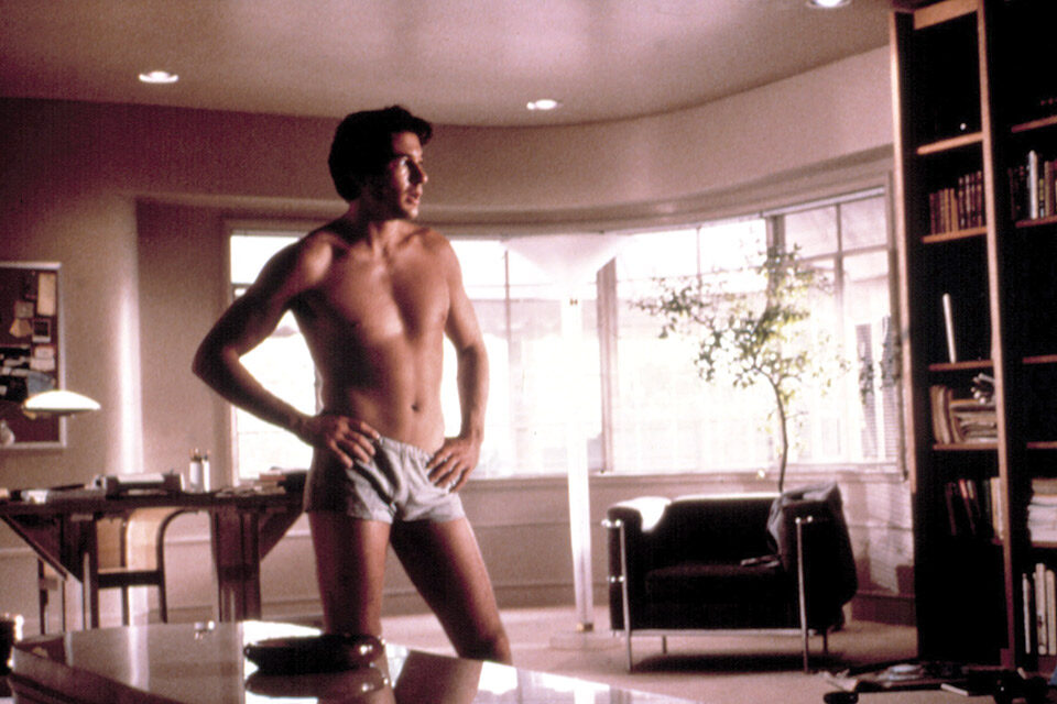
American Gigolo
When you see Gere walk in the house, it’s a space created as if it were in a set. Everything in that scene—with the exception of the ocean—was not there. Everything was built. The carpet and the walls and the paintings and the props. And that was the mentality that The Conformist brought to the movies, that a realistic location is in fact like a set.
What would happen if Ferdinando had to shoot in a location that he didn’t like? I had a scene in The Polo Lounge in Beverly Hills. And he didn’t like The Polo Lounge, he thought it was ugly. But The Polo Lounge is at the Beverly Hills Hotel and that was a story point. So we shot the scene outside The Polo Lounge and in the lobby, and then Gere walks into “The Polo Lounge”—which Ferdinando had built. The actual location is very famous in L.A. and particularly famous in the film industry; everybody knows what it looks like. But Ferdinando’s version was different. It’s all color-coordinated with his clothes and everything else, down to the little lamps and everything. For Scarfiotti, a location was not a location, it was an opportunity.
The impact of Scarfiotti in American Gigolo went much further than the films he did. Michael Mann loved the look of the film, and when he was doing a film called Thief, he tried to hire Ferdinando. Then when Mann went on to do Miami Vice, he took all those lessons that he had gotten from Ferdinando. That notion of Miami Vice comes right from American Gigolo—which comes straight from Scarfiotti.
The freedom of Scarfiotti’s production design is still with us today. If you watch CSI or any number of these shows, you get very unrealistic sets—odd colors coming into rooms. Who would have seen a police department office like one of these rooms you see? That was the freedom that The Conformist brought to set design, location scouting, and beyond.


